Cary’s Rebranding Hits Final Stage
Cary, NC — In a work session of the Cary Town Council on Thursday, September 9, options for a new Cary logo and tagline were shown and discussed.
With no consensus made, there was not a vote to adopt any of the logo options, but Cary may have its new tagline — “Live Inspired.”
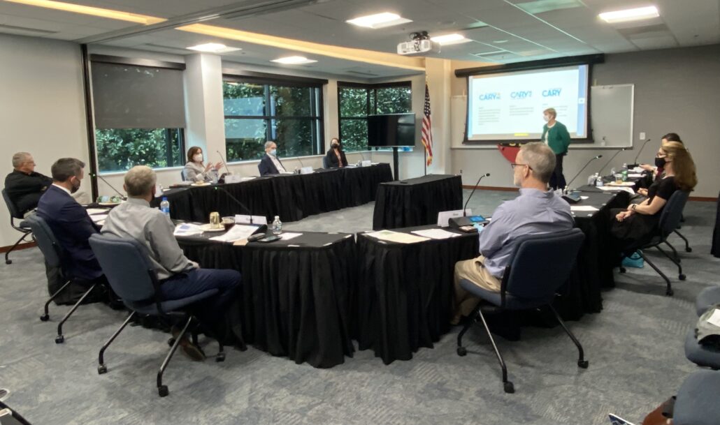
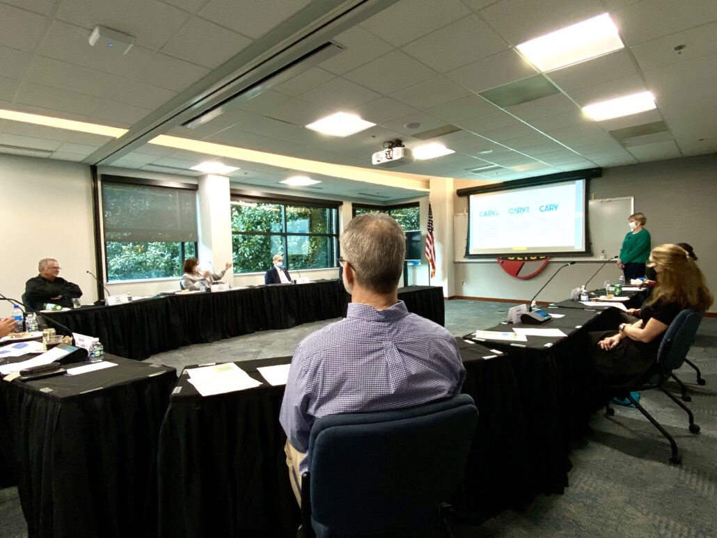
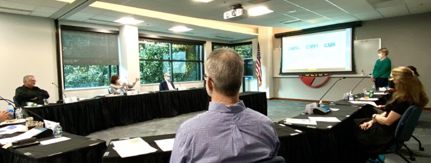
Cary Town Council members met inside the Cary Police Department training room, during which, not all members opted to comply with Cary’s state of emergency/mask mandate.
Cary’s Chief Strategy Officer, Susan Moran presented the materials, summing up the 4-year process of research and content development. As she explained, the driving force behind the branding effort has always been to “give our community a leg up.”
As Cary’s Town Manager, Sean Stegall put it, this rebranding has been long overdue and it has now reached the final stage before implementation. That is, pending the majority approval of the council.
A Mixed Bag of Reactions
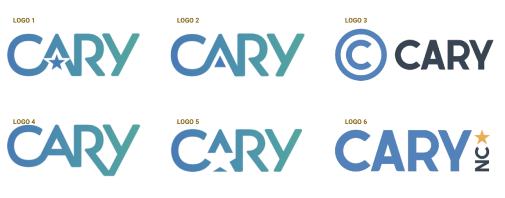
Some preliminary logo options were shown to the council before showing the more polished, top 3 choices for their consideration.
From focus groups and online surveys, some of the words that people described Cary as were: innovative, high-end living, high earners, well-run, desirable and diverse. These were focal points for the logo design teams to try to visually represent.
Just after unveiling the top 3 options, some of the first few first impressions from the council were on the contrary, with descriptors like, “basic, uninspired, elementary and disappointing.”
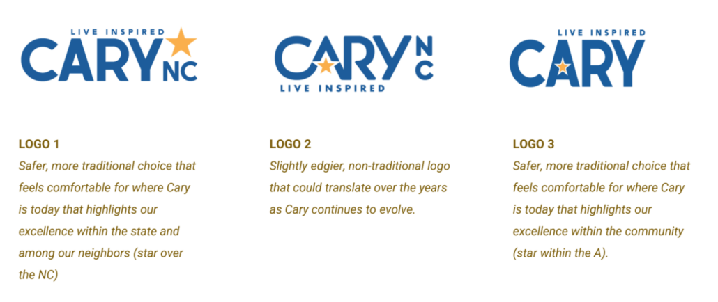
A slide from the presentation shows the top three options and describes what each represents.
“From Nothing to Something”
As both Stegall and Moran explained to the council, these options are to freshen up Cary and stop the use of its current logo and seal which Stegall says have been doing the community a disservice.
Moran also said, “This isn’t the logo of the century or the tagline of the century. This is an effort to move from nothing to something.”
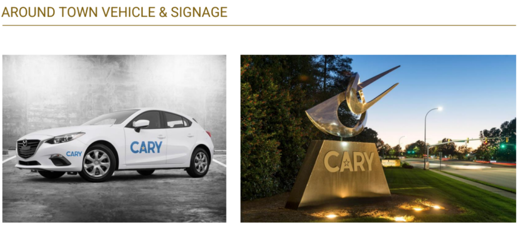
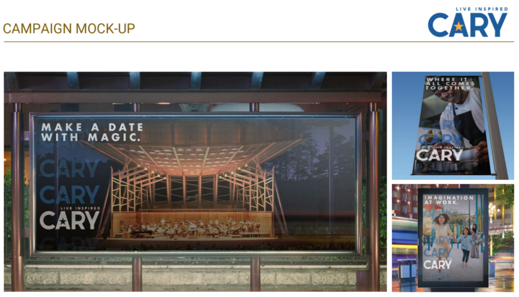
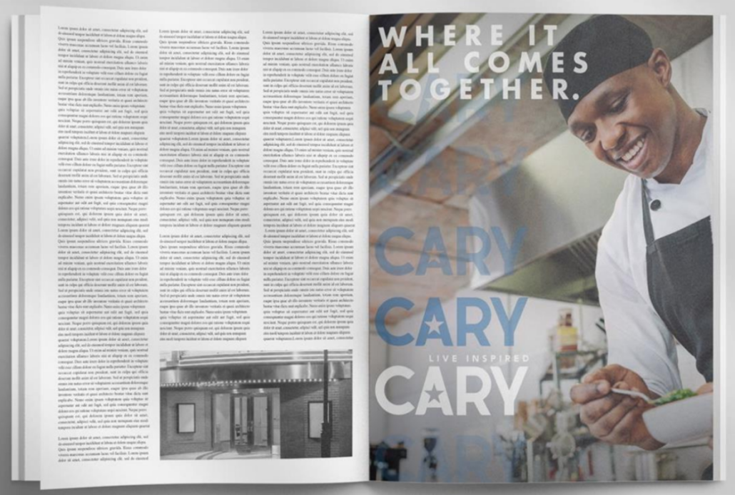
One of the companies the Town’s worked with, French West Vaughn, put together a mock-up with a logo chosen at random to give the council an idea of the look and feel of it on government vehicles, advertisements, in magazines, etc.
Council Discussed Initial Thoughts
Starting off the conversation of opinions was Councilmember Lori Bush who was honest in saying, “I don’t like any of them.”
While she didn’t mind the tagline, “live inspired,” she said the logo itself felt uninspiring and she felt the team could do better in creating something more representational of Cary.
Councilmember Ya Liu said she too liked the tagline, “Live Inspired,” but would like to see a bit more creativity with the design. Ed Yerha sided with Bush, saying he too didn’t really like any of them initially. He described the options as okay, clean and fresh.
“I’m okay, but I’m disappointed. After all the time we’ve spent on this and all the effort that we took on this, I would have liked to have had something that was unique in here,” said Yerha. “I don’t see this having a parallel to Cary.”
He mentioned the example of Apex’s logo with the synergy of the name with the design and tagline “The Peak of Good Living.” Bush also mentioned positives from nearby logos such as Morrisville and Raleigh with the imagery of a tree for the City of Oaks.
“I don’t agree with your points, I really don’t,” Mayor Pro-Tem Don Frantz said to Bush.
Speaking to the options presented for Cary’s logo, he said, “For me, I think it’s fine. I think it looks good on the cars and the imagery in the magazine and other places. I think it’s clean, it’s neat, it can be used in all kinds of ways.”
The Yellow Star Conversation
Councilmember Bush’s also explained she has what she called an underlying problem with the logo.
“The yellow star, to me, screams to my heritage to where I have seen yellow stars. So, I don’t like that. I’m not saying you should avoid yellow starts at all costs, but that is what I bring to this conversation as a granddaughter of a holocaust survivor and victim.”
Most were sensitive and receptive to this feedback, some suggesting a change of the color, others speaking more to the meaning that the star might have, one is for a capital city like Raleigh.
Councilmember Jennifer Robinson said, “We are south and west of Raleigh and in the first logo we are south and west of the star.” She did particularly love the comparison and said if one was used, she’d prefer it be integrated differently.
“And I do think we should be cognisant of Lori’s perspective because she has a perspective that probably many other people share. I think we should be sensitive to that aspect of the color of yellow for the star. I had not thought of that and I appreciate hearing her say that,” said Robinson.
After noting Lori’s point, Stegall did mention that in testing ideas with citizens and various groups, many people and Americans, in general, love stars. It tends to be a safe, less controversial choice with many positive connotations and that’s why it moved to this final round.
Councilmember Jack Smith was one of the last to speak. The way he saw it, the council is at a point to either “give up and go with things as is” or “make a decision that doesn’t have to be permanent forever.”
On the gold star conversation, Smith said culturally and with how children are now being raised, “people find a reason to be hurt and offended.” He said, “Sometimes we just have to look at what is the intent and what is our feeling that it relates to most of the community.”
He continued, “I’ve had two people perish at Dachau so, I know. My family was part of that persecution that was over there. Never, ever after 60-some years did I now tie this yellow star, but I understand it can be personal to some folks. But, if we start thinking about what’s personal for every person in the country, we’d go out of our minds.”
Tagline Stays, Logo Will Return
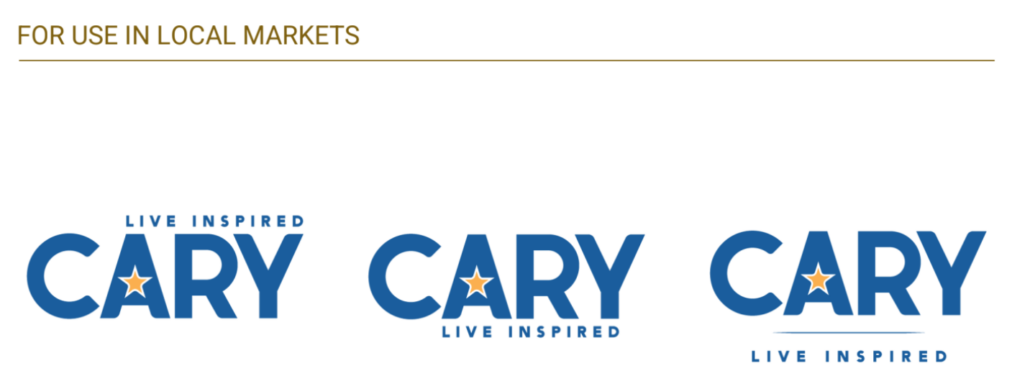
On a local level, such as on government cars and signage, the logo would only include “Cary,” whereas, for out-of-state and international uses, the logo would include “NC.”

In closing the topic, Mayor Harold Weinbrecht noted the logo has been a long time coming and he wants to see the council be fully ready for this decision as it is an important one. Himself, Smith and Robinson have seen the logos the most through the process as part of a subcommittee.
“We’ll take these three and suggest others be presented and we’ll bring it back and discuss it at that scope since we don’t have a unanimous agreement. Maybe we can get closer with a bigger scope,” said Weinbrecht.
Stegall also noted before the work session closed that it was a big accomplishment to seem to have a full agreement on the tagline, which tends to be the hardest part.
“To keep Cary great, we have to think really, really big. Think bigger than North Carolina, think nationally at trade shows, and really being competitive well into the future,” said Stegall.
“In order to do that, we need Fortune 500-level quality marketing pieces.”
Speaking to the reactions and how the logo will resonate with citizens, Stegall said the message is that Cary is a special place and a place where you can live inspired. He worries that if the process leans in a way that is too artistic the logo will start to speak to something that is not the citizens’ experience.
The process will continue on in the next work session, which is currently scheduled for September 23, 2021.
According to Stegall, once there is an approved logo, there won’t be a long timeframe between the adoption and the Town staff really going forward with a big, comprehensive marketing campaign.
Story and photos by Ashley Kairis. Logo renderings courtesy of the Town of Cary.
All the Cary news for the informed Cary citizen. Subscribe by email.



I vastly prefer logo 2 of the 6 shown. It is innovative, forward thinking, designed well and presents a modern image to the town. Everything else makes it feel stuck in the old impressions/bad judgements of Cary which people have said are boring and homogenous. We are more evolved than this on a lot of levels. Our logo should reflect that too. Any opportunities for more citizen feedback?
I tend to agree that the tag line is good, but the logos don’t live up to it. The logos don’t seem to “snap”. Also, although we’re in NC, we need to be thinking of an impact far beyond the state – and have a logo and reputation that isn’t just tied to or limited to the state.
No star please..too soviet.
Paul, I couldn’t agree with you more. Also, stars are used to signify state capitals and these days whenever I see a start, I think of Texas, which we are also not. I don’t see how a star is inspiring.
Seems like Cary is just keeping up with the Joneses. No money should be wasted making all new signs and “branding” Cary…it is a town, it already has it’s branding. Are we unimpressed with the growth an accomplishments that Cary has made? To me Cary has done great with what it has in place already and as the old saying goes “If it ain’t broke don’t fix it”. Not once does it mention what the impetus for this branding. Has a return on investment exercise been done to see what the rebranding costs and what the impact will be financially? Seriously this branding exercise seems very vain and unnecessary.
Unfortunately, the caption under the picture that says council opted to not wearing masks is misleading. The council was having the work session and dinner at the same time. The picture you see, if you look closely, has food or food items at the seats of the council and staff members. If I remember correctly, all council and staff had masks before sitting down.
I will make sure to remind council to wear their masks when not eating at the next council work session.
Thanks – Harold Weinbrecht
Thanks for that clarification, Mayor. No intent was made to be misleading, as most (5/7) council members did wear face coverings after eating/while not eating.
As an observer, I just found it notable that 2 remained maskless for the entirety of the 1 hr. 15 min. work session. To everyone’s credit, all members did comply for the full length of the Town Council meeting that followed in the Town Hall chambers.
This is almost a good point – though Cary isn’t the actual capital. And he “Capital” symbol on a map is typically a star inside of a circle, anyway. Make it black, put the circle around it, perhaps put an indicator on the SW mark on the circle to denote Cary, and then see what comes back.
Really? People “…find a reason to be hurt and offended…” by a symbol that, when used in this style, reproduces almost exactly the symbol of modern-day genocide? It is also a problem that people find reason to shout when you drop a brick on their foot, or find reason to complain that they’re hungry after skipping breakfast and lunch?
That’s terrible and tone-deaf phrasing, at best, if Councilman Smith didn’t mean that concerns about a yellow star in the Cary logo were inappropriate or misplaced; and if he DID mean it, well, I guess there isn’t really much left to stay about that statement – it speaks for itself.
I mean, it’s not like this process is bound by any sort of rule or convention that would require a star – our town name and history have no star entwined in the history of the town, we have no existing convention for a star in Cary-related stuff. The only relevance of a star is that there’s a white star between the N and the C on the state flag.
This is a completely new imaging, and the one graphical object we picked was a yellow star. Not the dogwood flower from our seal, or a light bulb (“Inspired”), or an upward arrow (because Cary is rated at the top of many measures of life in the Triangle)…but specifically a yellow star.
Logo 4, with a dogwood flower
https://imgur.com/a/4hB97md
After seeing the photo caption that said some Council Members opted to not comply with the mask mandate, I contacted the Mayor and two others. I was irate, drawing from the caption that they had chosen to not mask up during the meeting. They have all informed me that it was a dinner meeting and everyone had been eating and no one opted out of wearing a mask. Please take care when describing various activities to be certain your postings are accurate.
Marla, I was there for the duration of the work session and I assure you it was an accurate description. Thank you for your comment.
Thank you, Ashley, for this response and yours to the Mayor. I’m afraid there are Council members who found “I’m eating,” as a convenient excuse.
I’d love to see a logo that points to both the past and future of Cary. If a part of our community is offended by the star, I’ll bet the professionals could come up with something even better.
I’m actually quite disappointed with the logo and the proposed branding for Cary. I think going back to the drawing board is needed or leave it alone. And just because people like stars, why include in our branding? Where’s the creativity? Please don’t just change the town branding for the sake of change or to try to keep up with other towns. It must be meaningful.
Hope our good town did not pay in advance for these logos. Simplistic and uninspired. Truthfully they look like a 7th grader did them in about 12 minutes. Gold star? Seriously? Be smarter people.
No thank you.
The logo is not exciting and fresh. It looks like a political campaign logo. I do hope they come up with something more innovative.
I like the blue color and font. It looks good on that white Town of Cary vehicle.
Maybe a different symbol. A red cardinal is about to become Cary’s unofficial mascot when they are installed in the park. The Mayton has installed red cardinal bike racks which look great. Maybe a red silhouette of a cardinal?
I can imagine Cary spent more money on the silly rebranding than on the crazy sharrow paint…
(In the past I’ve relocated six times around the U.S. and never noticed a locale’s “brand” and what influence it had on me choosing to live there.)
What a sad waste of time. I agree with Cindy that it just looks like a political campaign logo and with Marla that the star makes me think of Texas. I guess the proposed logos look fine on the “campaign mock-up”, but for other uses, I don’t think it looks goo. Sure the logo stands out on white vehicles, but blue lettering + star would make every Town with that logo look like a cop car which I think could be confusing. I do like a sans serif font on the base of the sculpture on Harrison better than what’s currently there, but in the mockup the star in the middle of the A makes it hard to read – when I glance at it, it looks like the word “CRY” with road running between the C and the R.
My biggest question is what elements of Cary’s existing branding this this supposed to replace?
Because I think a lot of the existing brand is really strong. The serif font “Town of Cary” might look a little old fashioned for a magazine advertisement, but it looks fantastic on signage (e.g., the Good Hope Farm sign shown here: https://www.townofcary.org/home/showpublishedimage/29674/637660983850300000 ). I really LOVE the branding of our parks and greenways, with the dogwood flower and blue and green color scheme – it looks so sharp and makes it so easy to spot the Cary brand from a distance. My kids also get kind of excited to see the dogwood flower seal on manhole cover, lol. I am actually even really fond of the “T of C” icon for browser tabs open to Town of Cary pages even though it’s a bit pixelated because it makes it really easy to find my Town of Cary tabs among the dozens of other browser tabs I have open at any given time.
After all this time all they came up with is block lettering with a star in the ‘A’? That could have been farmed out to the Senior class at Cary High to come with.
They could have at least come up with something like this:
https://www.caryseniorteched.org/images/Town-of-Cary.jpg
Only with “Live Inspired” around the outter edge instead of the PR&CR band.